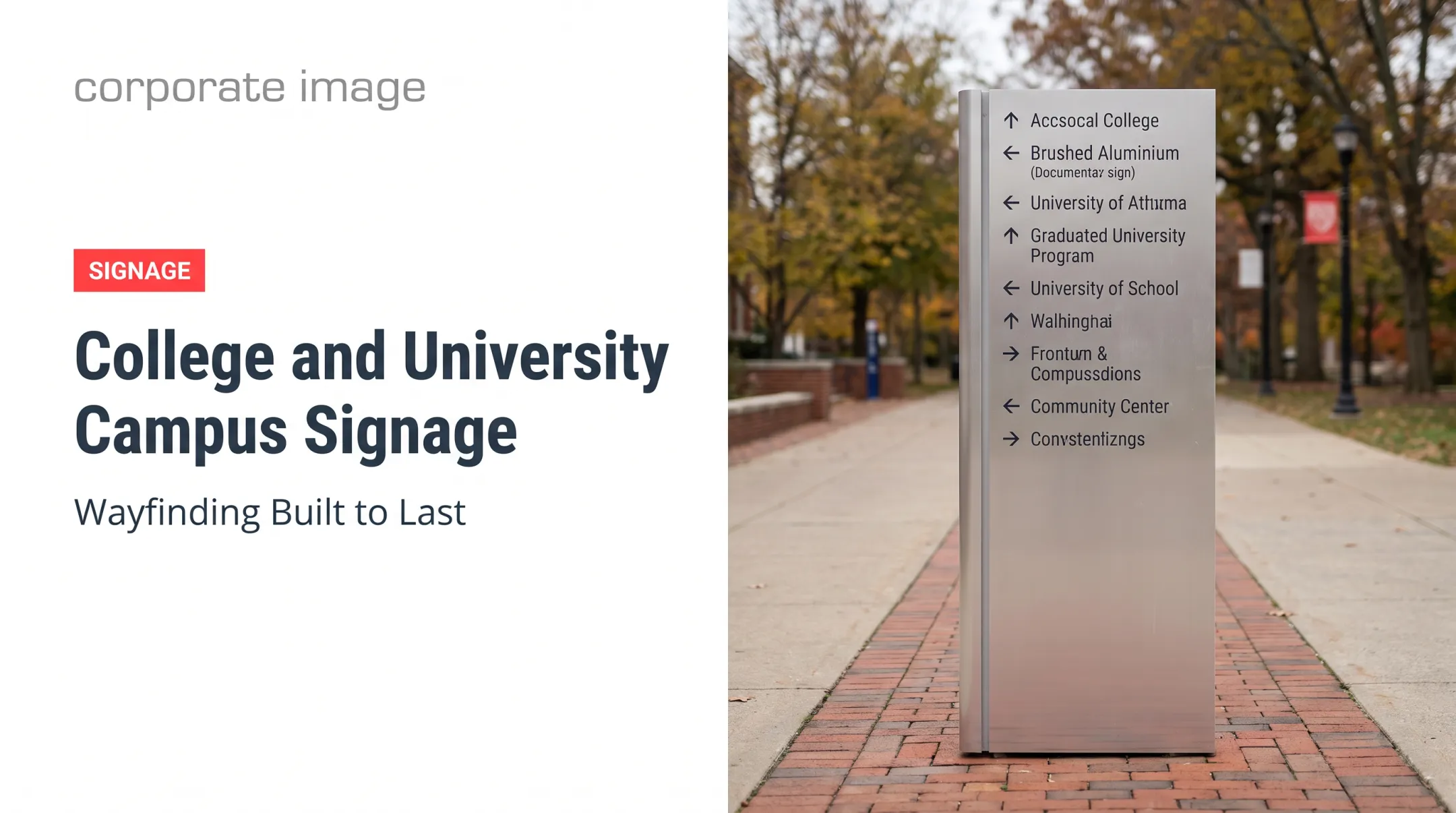
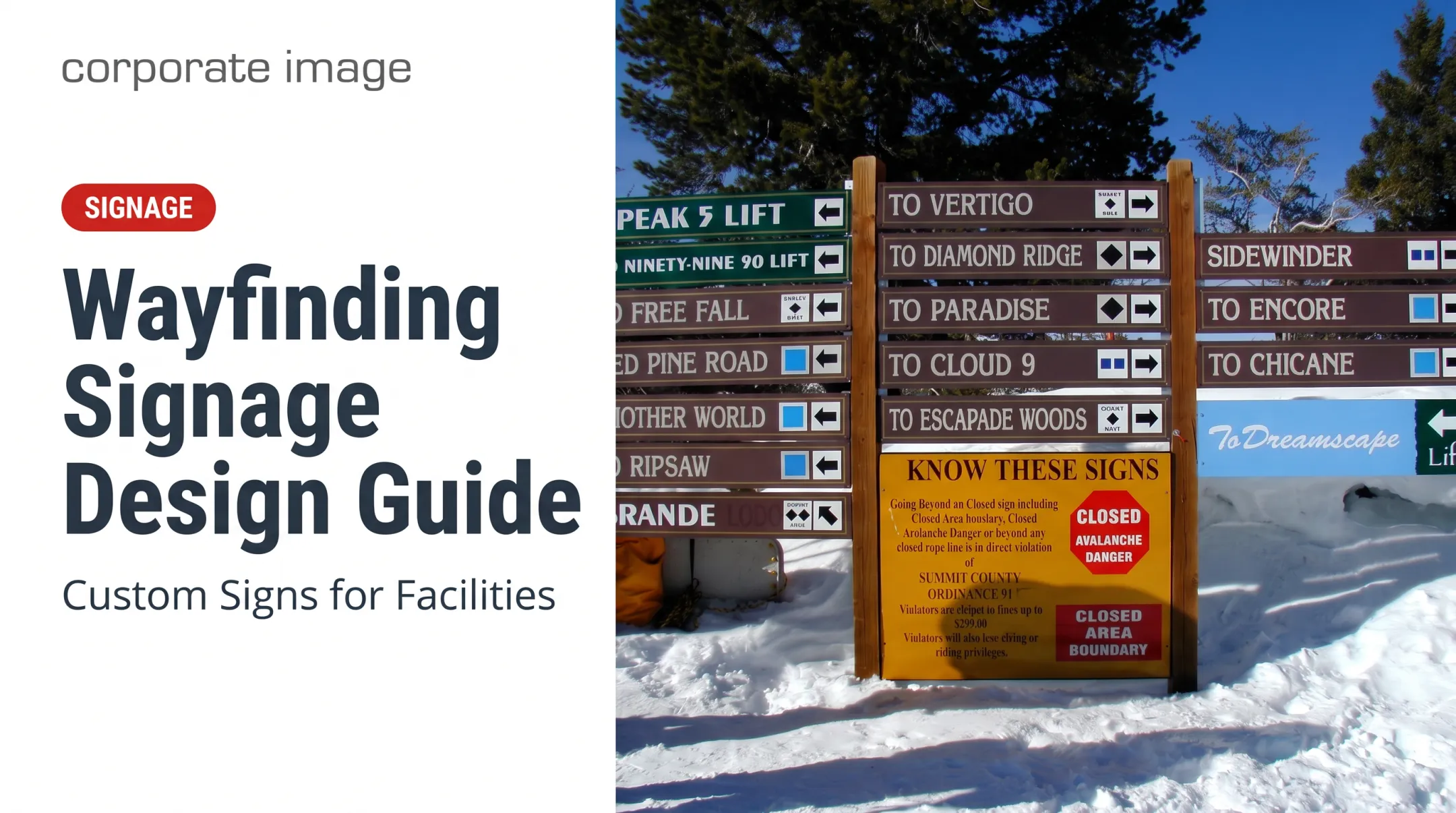
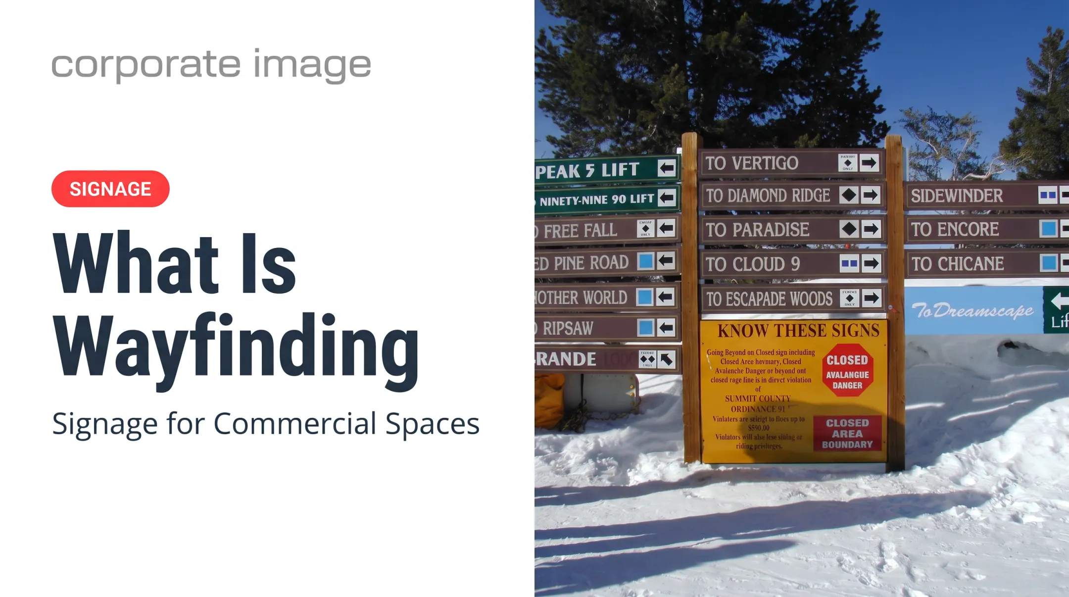
City wayfinding signage design is a coordinated system of signs, maps, visual cues, and placement decisions. It helps people understand where they are, choose a route, and reach a destination.
This guide covers sign types, design principles, planning, accessibility, materials, cost drivers, and common mistakes.
Key Takeaways
- Plan wayfinding as a connected system, not a pile of individual signs.
- Clear hierarchy, consistent cues, smart placement, and durable materials drive results.
- Audit locations and analyze routes before fabricating anything.
- Budget for design, approvals, site work, installation, updates, and upkeep.
What Is City Wayfinding Signage?
A single directional sign points. A wayfinding system carries someone from arrival point to destination: intersections, parking areas, pedestrian routes, transit connections, plazas, and the front door. Each sign picks up where the last one left off.
The terms vary between projects. Seattle's 2019 strategy, for instance, uses "Overview," "Nudge," and "Area" signs. A common four-part grouping still works as a planning tool:
- Orientation and informational signs: maps, "you are here" panels, directories, and kiosks
- Directional signs: arrows, destination names, and distances at decision points
- Identification and gateway signs: city entrances, district markers, and facility identifiers
- Regulatory and public-information signs: rules, safety instructions, access and parking guidance
The Manual on Uniform Traffic Control Devices (MUTCD) treats regulatory, warning, and guide functions separately, so regulatory signs are never interchangeable with destination guidance.
These categories serve drivers, pedestrians, cyclists, transit riders, visitors, and residents. They also serve people with different mobility or language needs, which is why a system needs more than one sign type.
Core Principles of Effective City Wayfinding Signage Design
Design Around Real Behavior
Find where people arrive, pause, hesitate, switch travel modes, hunt for parking, or need reassurance. Signs belong at those moments, not where the map looks tidy.
Prioritize Legibility and Hierarchy
The MUTCD recommends at least 1 inch of letter height per 30 feet of legibility distance for traffic signs. That is not a pedestrian-map formula, but it shows how viewing distance drives size.
- Use brief, plain messages and few abbreviations
- Put the most-needed destination first
- Keep contrast high and finishes non-glare
- Check signs in daylight, dusk, and artificial light
- Limit MUTCD community-wayfinding guide signs to no more than three destinations
Cut anything that doesn't help someone make the next decision.
Build One Visual Language
Standardize the system so users never relearn it at the next corner:
- Fonts, colors, icons, and arrows
- Terminology and map orientation
- Sign shapes and mounting details
For motorist community-wayfinding signs, MUTCD prohibits decorative lettering and red, orange, yellow, and purple backgrounds.
Treat Placement as Design
Seattle's strategy places guidance where routes start, end, cross, merge, or diverge. Major decisions get maps; minor ones get small "nudge" signs.

Before you install, check:
- Sightlines and traffic speed
- Pedestrian flow and landscaping
- Parked vehicles, clutter, and snow
A sign that fails to appear before the decision fails, however good it looks.
Balance Function and City Identity
Materials, color, landmarks, and neighborhood themes can give a place character. Keep them subordinate to readability. If a sign feels decorative first and useful second, rework it.
How to Plan and Develop a City Wayfinding System
Follow these steps:
- Audit existing conditions. Document missing, redundant, outdated, damaged, inconsistent, or poorly placed signs. Denver's 2024 Union Station strategy began with a sign audit and movement analysis.
- Map destinations, users, and modes. Include civic buildings, hospitals, campuses, parks, parking, transit stops, bike routes, accessible entrances, and cultural districts.
- Write the messaging and location plan. Decide which destinations appear on each sign, how far ahead a decision point needs one, and where to repeat information for reassurance.
- Build a sign family and test it. Use sketches, route diagrams, prototypes, field reviews, and first-time users. Seattle's engagement included intercept surveys, focus groups, workshops, and user testing with more than 200 participants.
- Plan delivery and budget. Coordinate design, surveying, mapping, engineering, permits, fabrication, and installation.

Cost Factors, Not Per-Sign Prices
Budget line items typically cover:
- Design, mapping, and engineering
- Permits, fabrication, foundations, and hardware
- Installation, traffic control, and landscaping restoration
- Ongoing updates and maintenance
Portland's 2019 scoping study flags content updates and damage as recurring costs.
Published municipal figures are bundled packages. Addison, Texas, presented a $485,000 Phase 1 for welcome and landmark signage, $295,000 for pedestrian and trail items, and $602,000 for vehicular and parking signage. Those cover whole scopes, not unit prices.
When cities move from plan to build, a single vendor can keep design, production, and install aligned. Corporate Image, a Salt Lake City sign producer with more than 30 years of experience, handles custom municipal signage with coordinated design, production, and installation by 3M-certified installers.
Materials, Accessibility, Compliance, and Long-Term Performance
Match Materials to the Environment
Consider UV, rain, snow, freeze-thaw cycles, wind, road salt, vandalism, cleaning, temperature swings, and vehicle impact. Indoor, streetside, and resort settings each demand different choices.
Published material claims are a starting point, not a full system rating:
| Material | Performance notes | What to confirm |
|---|---|---|
| Aluminum | 3M identifies properly prepared aluminum as a durable sign substrate | Project-specific lifespan for your climate and finish |
| HDPE | Engravable HDPE is described as resistant to UV and water | Rated service life from the manufacturer |
| Fiberglass | One-piece weatherproof panels are offered with UV protection | Warranty terms before you specify the product |
| Vinyl graphics | 3M cites 8-year unwarranted expected performance for unprinted film | Film life versus full sign assembly life |
Corporate Image's own mountain trail signs show the approach: a corrugated-plastic core instead of wood, UV-resistant gel-coat paint, and vinyl decals for trail names and directions. The signs can be sanded and repainted if destinations change.
Fabrication details matter too. Consider panel construction, applied graphics, protective finishes, mounting, foundations, edge treatment, and swapping single panels without replacing the whole sign.
Accessibility and Compliance
Generic good design is not legal compliance. Verify current federal, state, and local rules for each project. Under the 2010 ADA Standards:
- Sections 216 and 703 separate permanent room identification from directional and informational signs
- Directional signs must meet 703.5 visual-character rules, but tactile text and Braille are not generally required for them
- Tactile signs need raised characters with 1/32 inch minimum relief and Grade 2 Braille
- Tactile baselines sit between 48 and 60 inches above the floor or ground
- Visual characters need nonglare finishes and strong contrast. There is no numeric 70% threshold in current 703.5.1; that figure comes from older 1991 guidance
The Access Board issued final PROWAG on August 8, 2023, with agency adoption dates that differ by scope.
Pedestrian vs. Vehicular Signs
Roadway-facing signs involve traffic-control standards, retroreflectivity, engineering review, and permits. The current MUTCD is the 11th Edition with Revision 1, effective March 5, 2026.
Motorist community-wayfinding signs require retroreflective backgrounds, legends, and borders. Pedestrian wayfinding signs should not be retroreflective. Those systems instead favor maps, walking times, accessible routes, and human-scale placement.

Plan for Maintenance From Day One
- Assign an owner (NYC DOT maintains WalkNYC)
- Build a sign inventory, since inspection alone may not reveal a missing sign, per FHWA
- Schedule inspections and cleaning
- Track damage and replace outdated destinations
- Set a process for future phases and rebranding
Common City Wayfinding Signage Design Mistakes to Avoid
Treating Signs as Isolated Objects
Inconsistent names, arrows, colors, fonts, map orientation, or mounting styles undermine even a handsome sign. Denver's audit found patchwork guidance at the edges of its station area.
Overcrowding Signs and Maps
Prioritize destinations, group them clearly, and separate essential navigation from optional information. Point users to other resources when needed. The MUTCD addresses excessive signs and message limits directly.
Skipping Field Validation and Upkeep
- Overlooked sightlines and new landscaping
- Construction changes that hide or invalidate signs
- Inaccessible placements
- Outdated destinations
- Poor nighttime visibility
Seattle's strategy flags outdated information and maintenance funding as problems. A system with no responsible owner loses reliability quickly.
Frequently Asked Questions
How much does a wayfinding sign typically cost?
It depends on size, quantity, design, materials, mounting, foundations, permits, and installation conditions, plus whether the sign serves pedestrians or vehicles. Request a project-specific estimate rather than relying on an average.
What are the four types of wayfinding signage?
Orientation or informational, directional, identification or gateway, and regulatory or public-information signs. Terminology varies by project.
What is wayfinding in design?
It uses signs, maps, symbols, color, typography, placement, and environmental cues to help people understand their location, choose a route, and reach a destination.
What are the requirements for wayfinder signage?
Verify current accessibility, traffic-control, visibility, permitting, zoning, safety, and local design requirements with the relevant U.S. authorities before finalizing a system.
What is the best color for signage?
No color is universally best. Choose based on contrast, legibility, lighting, surroundings, accessibility, brand standards, and consistency. About 1 in 12 men have color blindness, so never rely on color alone.